At PCAOB, employees use an internal ticketing system to submit requests about their work. But the service desk team shared that too many general or unclear tickets were making it harder for them to do their job efficiently. So, we set out to understand where users were struggling and redesign the portal to guide them better — making it easier for everyone to use and easier for the service desk team to manage.
Role : Senior UX designer
Project Duration : 2 months
Tools Used : Azure RP, Usability Testing Miro
The Challenge
When our team inherited PCAOB’s internal ticketing system, we discovered a platform that wasn’t serving anyone well. Employees were waiting too long for resolutions, tickets were landing in incorrect categories, and the service desk team was overwhelmed with calls that could have been avoided.
We identified two core problems to solve:
- How do we help employees submit tickets in the correct categories?
- How do we empower service desk agents to resolve issues more efficiently with less back-and-forth?

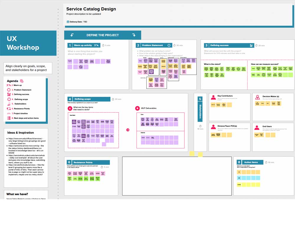
Listening and Learning
To truly understand what wasn’t working, I spoke directly with the people involved. Through user interviews and focus group sessions, I mapped out user journeys and created personas for three core groups:

End Users
Employees submitting requests in the portal

Service Desk Agents
Employees who work on resolving tickets

Strategic Business Partners
Internal stakeholders managing services
I mapped the end-to-end workflow with a service blueprint to surface friction across systems and teams. Users couldn’t find the right catalog items, often defaulting to a generic ticket. No quick way to repeat common requests. Agents lacked context, leading to follow-ups. Strategic partners fielded repeat calls for services already documented — people simply weren’t finding what they needed. To validate, I dug into ServiceNow data: high ticket cancellations, vague search terms, top-hit categories, and clear drop-off points confirmed the gaps.
Solving the Problems & Executing the Fixes
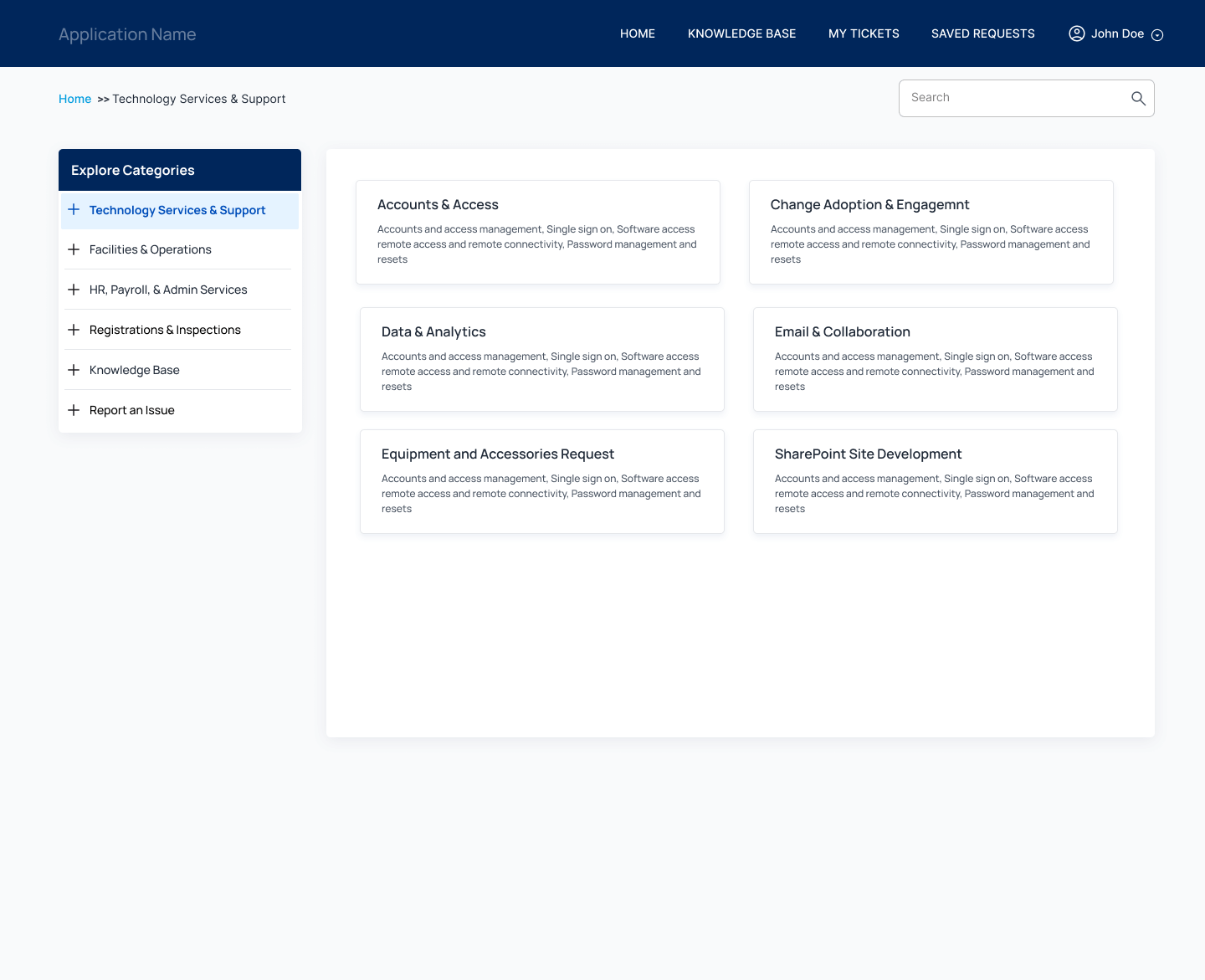
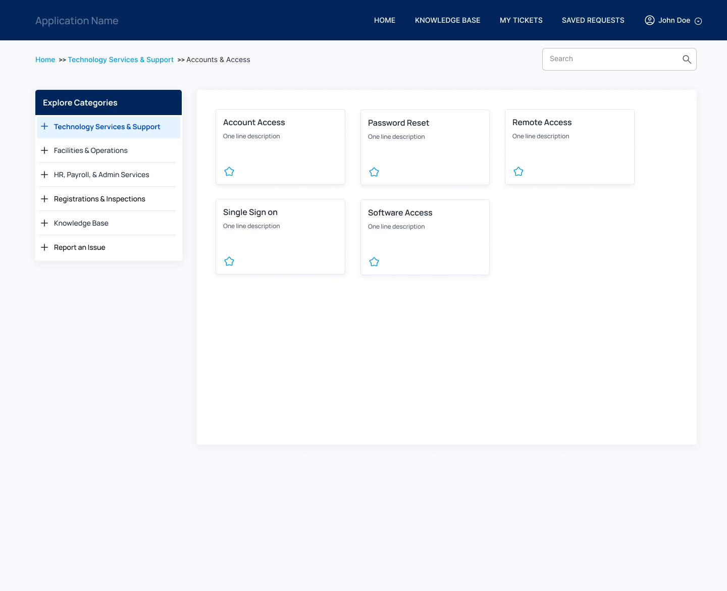
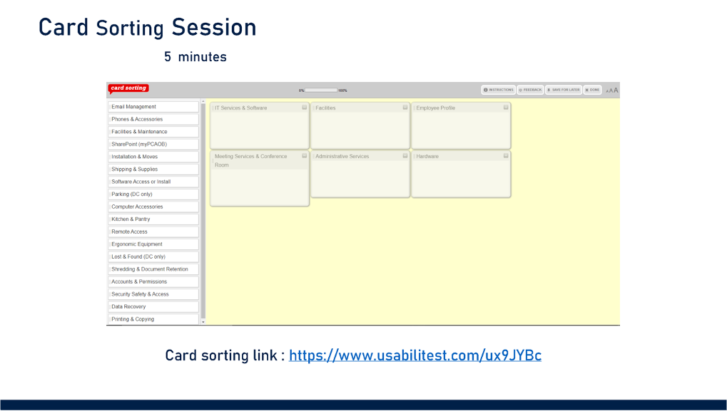
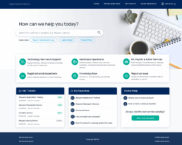
We reorganized categories through card sorting to match user mental models. The homepage got a full redesign:
Redesigned Screen
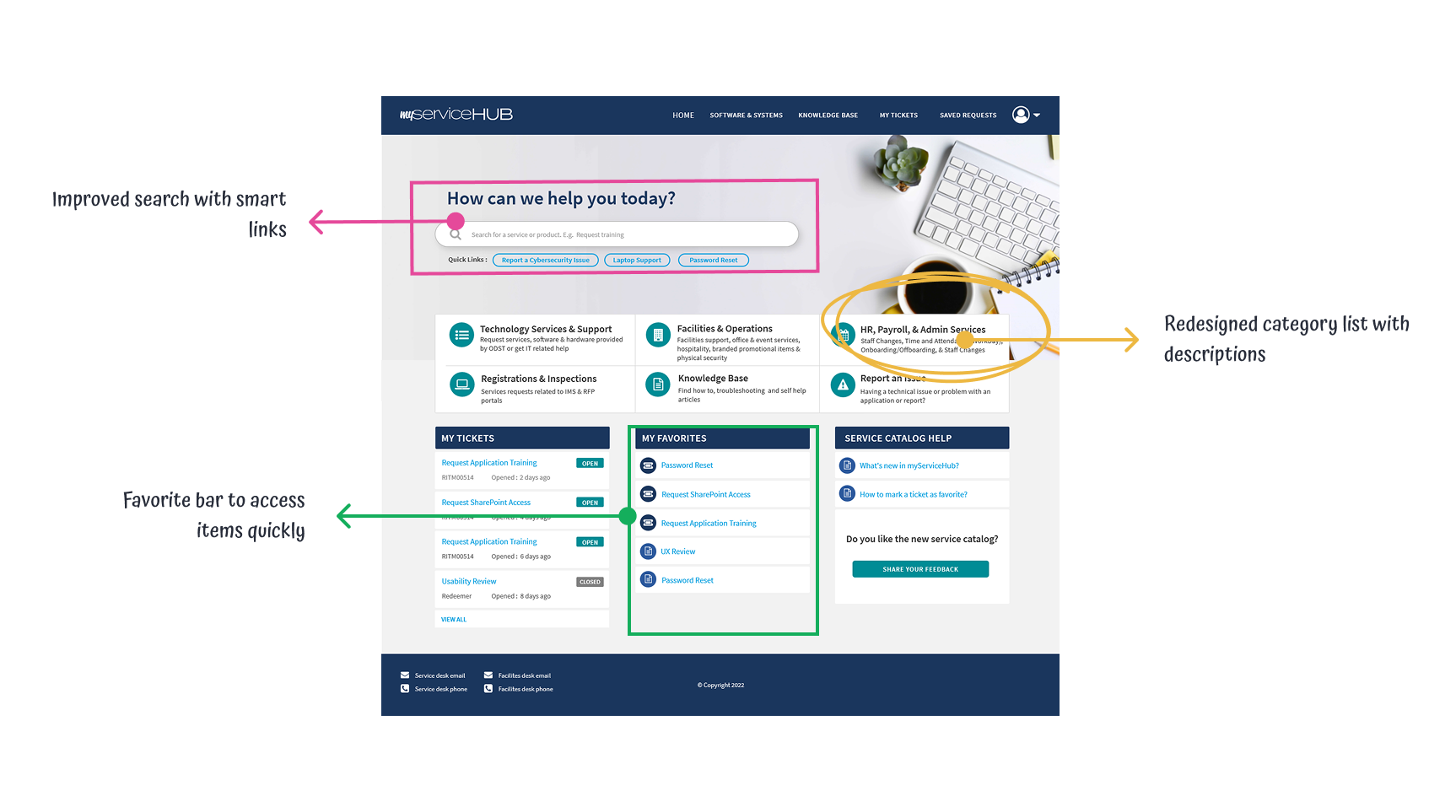
- A favorites bar for quick access
- Clone-and-reuse option for repeat tickets
- Smarter search powered by real usage data
- “General ticket” button removed from view unless search fails
- Embedded help articles, short videos, and behavior-driven smart links
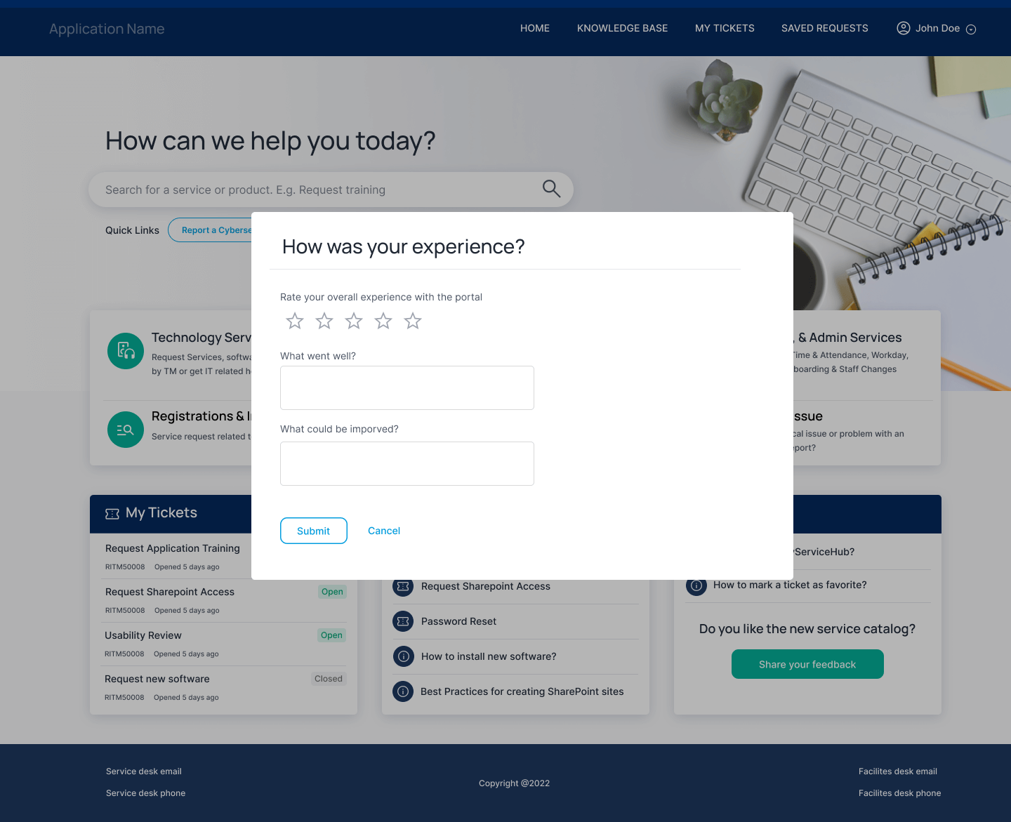
We built a design system to unify the experience and support future growth. Teamed up with training and change management to tailor rollout support across teams. Finally, we added automated updates throughout the ticket lifecycle so users stayed informed without needing to ask.
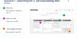
Putting It to the Test
Low-fidelity wireframes were tested using dot-voting to get fast feedback on layout changes. Then we moved to mid-fidelity prototypes, running hands-on sessions to watch how users interacted, surface usability issues, and spot where additional training would be needed.
Getting Everyone On Board
What we delivered wasn’t just a cleaner interface, it was a more usable and efficient system that aligned with how people actually work. The service desk got fewer calls. Users got better results. And the business had more visibility into what needed fixing. Ticket submissions became more accurate, with users selecting the correct categories, leading to a noticeable drop in reassigned and cancelled tickets.
20%
Increase in User Engagement
40%
Decrease in General Tickets
40%
Reduction in Ticket Completion Time
20%
Decrease in Cancelled tickets