Redesigned India’s largest bank’s mobile app, consolidating two legacy applications into a unified experience in just 20 working days. The new design streamlined complex banking workflows while maintaining enterprise-grade security, ultimately leading to a follow-up engagement for additional product consolidation.
Role : Senior UX Designer
Tools Used : iRise, Adobe Photoshop
Understanding the problem
State Bank of India, serving millions of customers, faced a critical user experience crisis:
- Fragmented Experience: Users juggled between two separate mobile apps for different banking needs
- Outdated Interface: Legacy UI patterns created friction in daily banking tasks
- Complex Navigation: Information architecture failed to support modern mobile banking behaviors
- Trust issues: Users hesitated because the experience didn’t feel consistent or reliable.
- Lengthy workflow: The number of steps slowed users down and led to drop-offs.
The Strategic Approach
I made three key strategic decisions:
- Prototyping over documentation: With only 20 days, I built a 120-screen low-fidelity prototype that acted as a living spec, cutting heavy documentation by about 40%.
- Progressive disclosure: Instead of showing everything at once, I broke the experience into smaller, related steps so users could focus without feeling overwhelmed.
- Aligning stakeholders through visuals: Since requirements were still unclear, I used quick visual iterations to drive decisions. This helped the team align and sign off in 10 days instead of dragging out discussions.
Trade-off: I went broader rather than deeper in early research to hit the timeline, with a plan to run deeper user studies after launch.
Key Insights & Pivots
Challenge: Users dropped off after a few screens
Anything beyond four screens felt overwhelming and slowed people down.
Action: Redesigned critical flows to complete in four steps or fewer.
Challenge: Navigation and terminology were inconsistent
Menus were hard to find, labels changed across screens, and users had to stop and think about where to go next.
Action: Introduced clear, easy-to-access menus and consistent terminology across the platform so users could move confidently without relearning the interface.
Challenge: Forms were long and hard to understand
Users struggled with non-intuitive forms and unnecessary questions.
Action: Simplified forms to be shorter, clearer, and focused only on required fields.
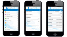
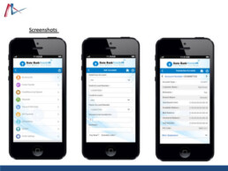
The Solution (The 'How')
Unified Navigation Architecture
- Added subtle haptic feedback on successful authentication to build confidence without adding extra steps
- Introduced context-aware navigation that adapts based on what the user is doing
- Used color-coded sections to help users orient quickly:
- Blue for accounts
- Green for transfers
- Orange for payments
Smart Transaction Flow
- Pre-filled forms using past transaction patterns, reducing manual input by around 60%
- Added inline validation with clear, helpful error messages, including local language support
- Showed a real-time balance preview during transfers to reduce hesitation and errors
Trust-Building Security Layer
- Used visual security cues like animated lock icons during secure sessions
- Provided transaction receipts with QR codes for easy offline verification
Information Architecture Highlights
- Reduced menu depth from five levels to a maximum of three
- Added clear back and cancel options at every step so users never felt stuck
Implementation
Delivered Outcomes
- Merged two separate apps into a single, unified experience
- Cut development time by using detailed, shared prototypes
- Client approved and commissioned an additional app consolidation project
Delivered Outcomes:
- Consolidated 2 apps into 1 unified experience
- Reduced development time through comprehensive prototyping
- Client immediately commissioned additional app merger project
40%
decrease in navigation-related queries
50%
reduction in taks completion time
40%